How Do I Decide Which Background Details Actually Help the Story?
A background can make a scene feel lived in, establish where a character is, or quietly foreshadow what happens next. It can also compete with a character’s expression, muddy an action beat, or become unreadable on a phone. The difference isn’t how much detail you add. It’s whether each detail earns its place.
When deciding what belongs in a panel, start with one question: What should the reader notice, understand, or feel here? Every background choice should support that answer—or at least stay out of its way. This is the core of useful storytelling detail: giving the setting enough presence to help the story, while keeping the subject and action clear.
This matters especially in comics and vertical chapters viewed on a phone. A beautifully textured room may look impressive on a large monitor at 100% zoom, then turn into visual noise when the reader sees the full panel on a mobile browser. I check layouts at 25%, 50%, and 100% zoom because each view exposes a different problem: overall hierarchy, small-screen legibility, and fine-detail quality.
Begin With the Job of the Panel
Before drawing or selecting background details, identify what the panel is doing. Is it introducing a location? Delivering a reaction? Showing movement? Establishing tension? A background that helps in one type of panel may distract in another.
- For an establishing panel: Show enough recognizable features to locate the reader in the scene.
- For a dialogue panel: Keep the setting present but quieter than the speakers.
- For an action panel: Use shapes and directional cues that clarify movement and impact.
- For an emotional close-up: Reduce or simplify the background unless it adds a specific emotional contrast.
- For a reveal: Control what the reader can see, and when, rather than showing every relevant object immediately.
Write the panel’s main purpose in a short phrase, such as “Mara realizes the shop is empty” or “the runner is about to collide with the open gate.” Then check each background element against that phrase. Does it strengthen the moment, clarify the space, or provide useful context? If not, it may be optional.
Build a Clear Visual Hierarchy
Visual hierarchy is the order in which the eye encounters information. In most story panels, the subject, action, or key object should be easiest to notice. The background comes after that unless the setting itself is the subject.
You can establish hierarchy through contrast, scale, color, detail, and placement. A character’s face can stand out because it is brighter than the room behind it. A key object can be larger or more sharply defined than nearby props. A background can recede through softer edges, fewer texture marks, or lower contrast.
Choose a focal point before adding texture
Decide what the reader should notice first, second, and third. For example:
- First: The character’s alarmed expression.
- Second: The broken window behind them.
- Third: The ordinary furniture that makes the break-in feel personal.
This order gives the setting a story function without asking every object to compete for attention. The broken window matters because it explains the character’s reaction. The furniture helps establish that this is their home. A detailed stack of magazines in the corner may add atmosphere, but if it doesn’t support the moment, it can be reduced to a few simple shapes.
When the background and subject have similar contrast, edge density, and color intensity, the reader has to work harder to separate them. This is the practical meaning of background vs subject: the background should help frame the subject, not merge with it. Look for tangents, too. A shelf edge that seems to grow out of a character’s head can create an accidental shape that pulls attention away from the expression.
Design for Small-Screen Readability
Phone screens change the rules. Fine patterns, thin lines, small signs, and low-contrast details can disappear or clump together when a panel is scaled down. A detail that reads clearly on a desktop may become a gray patch on a mobile browser.
Use a phone or mobile browser to review the work at the size people will actually encounter it. Don’t rely only on zooming in. At 100%, you can inspect craftsmanship; at 25% or in a fit-to-screen view, you can judge whether the panel communicates quickly. If the key action is unclear at that size, adding more detail usually won’t solve the problem.
Test legibility, not just decoration
- Can you recognize the character’s silhouette without zooming in?
- Can you identify the important prop from its shape and placement?
- Does the background remain distinct from the subject?
- Are any signs or labels large enough to read if they carry story information?
- Do textures collapse into distracting noise when viewed at phone size?
If a small label is essential to the plot, make it legible or find another way to communicate the information. If it’s merely decorative, it doesn’t need to be readable. There’s little value in drawing tiny lettering that looks like a smudge on the device most readers use.
Contrast is part of readability, too. A light speech balloon over a pale wall may lose its boundary; dark hair against a dark doorway may flatten the character’s head shape. Check important edges and text against their immediate surroundings. A restrained value shift or slot symbols design a simpler background shape is often more effective than adding outlines everywhere.
Leave Room for the Interface
On mobile, the artwork shares space with the reader’s device and the platform’s interface. Browser bars, page controls, episode navigation, and overlays can affect how much of a panel is visible at once. The exact interface varies, but the design principle is consistent: don’t place essential story information where controls or cropping can obscure it.
Think of this as a safe area. Keep faces, important hand gestures, critical objects, and story-bearing text away from edges that may be covered or clipped. In vertical storytelling, leave enough breathing room between key beats so the reader can scroll without losing where one moment ends and the next begins.
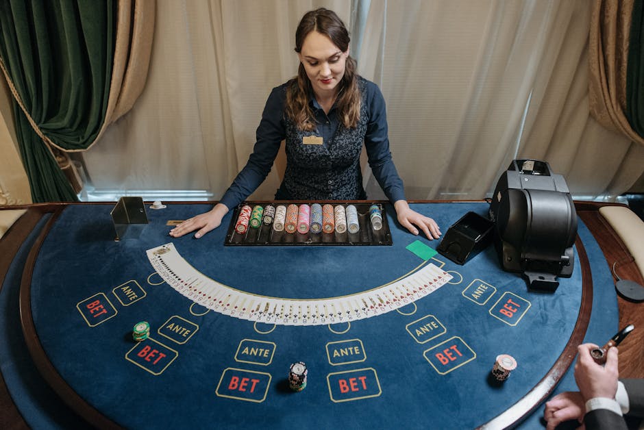
There’s a second kind of interface space to consider: in-world controls, rules, and balances. A panel might show a game screen, a betting interface, a scoreboard, or an account balance. These details can carry real stakes, but only if the reader can distinguish them from decoration.
Information shown What should read clearly Common background problem Controls Which action is available and where it happens Icons or buttons blend into decorative patterns Rules The condition that changes the character’s choices Small text competes with scene detail Balances or stakes The amount, status, or consequence the story relies on Numbers are too small or visually buriedIf a balance or rule matters to a real-money decision in the story, treat it as essential information—not set dressing. Make the relevant amount or condition readable, and avoid implying that a decorative icon explains a rule when it doesn’t. Unclear symbols create confusion, not intrigue.
Use Recognizable Silhouettes and Shapes
Readers often identify a location or object by its outline before they register surface detail. A distinctive roofline, a crooked streetlamp, a vending machine, or a recognizable tree can orient the reader faster than a fully rendered landscape.
Silhouette is especially helpful on small screens because it survives reduction. You may not be able to read every brick in a narrow alley, but you can recognize the alley’s strong vertical walls, overhead wires, and pool of light. These broad shapes also support panel clarity by separating important forms.
Make the setting recognizable with a few anchors
Choose one to three visual anchors for a location. These might be a unique window shape, a color accent, a landmark, or a repeated object. Reuse them when the location returns. Readers begin to recognize the place without needing a full tour in every panel.

For example, a small café might be established through its striped awning, a round wall clock, and a row of mismatched stools. In a later dialogue panel, you can show only the clock and one stool. The reader still understands the setting, while the characters remain the focus.
Pay attention to negative space: the open areas around and between forms. If a character’s arm disappears into a busy set of chair legs, simplify or reposition those shapes. If a key object needs to stand out, give it a clear gap from nearby edges. Recognizable shapes help the eye parse the panel; tangled shapes slow it down.
Borrow References Without Copying the Clutter
Reference images can speed up decisions about architecture, lighting, props, and atmosphere. Unsplash is useful for finding broad visual inspiration: a rainy street, a sunlit kitchen, a crowded market, or a particular kind of landscape. Use references to understand how a place feels and how its large shapes are arranged—not as a checklist of details to reproduce.
When looking at a reference, separate what is informative from what is incidental. A photo of a room may contain dozens of objects, but the story may need only the window direction, the table shape, and the light falling across the floor. Select details that clarify location, mood, or character behavior.
Also consider the practicalities of using a reference image. Check the image’s license and terms before reproducing or adapting it in published work. When in doubt, use it for study and create an original arrangement rather than tracing or copying a distinctive composition.
A Practical Pass for Editing Background Detail
When a panel feels crowded, don’t immediately redraw everything. Try an editing pass that protects the story’s essential information first.
- Name the focal point. Write down the one thing the reader should notice first.
- Mark essential context. Keep details that locate the scene, explain the action, or affect the character’s choice.
- Reduce competing contrast. Lower detail or contrast in areas that pull attention from the focal point.
- Check silhouettes. Separate important figures, props, and architectural shapes from one another.
- Protect interface and text areas. Make sure controls, rules, balances, captions, and speech remain visible and legible.
- Review at phone size. Open the page in a mobile browser or view it at a realistic screen scale.
- Remove one more thing. If the panel still reads without a decorative element, consider leaving it out.
Ask what changes if a detail disappears
This is a fast, reliable test. If removing an object makes the location impossible to recognize, the object may be doing useful work. If it removes a clue, mood cue, or meaningful contrast, keep it. If nothing changes except that the panel becomes easier to read, the detail was probably unnecessary.
That doesn’t mean every background must be sparse. A crowded festival, a cluttered workshop, or a chaotic control room may be exactly what the story needs. In those cases, the density is part of the message. Still, organize the clutter: group objects into larger shapes, reserve contrast for key actions, and give the reader a clear path through the panel.
Make Every Detail Support the Read
The best background is not always the most elaborate one. It’s the one that helps the reader understand the moment, feel its atmosphere, and keep moving through the story. Strong visual hierarchy points toward the focal point. Small-screen testing catches details that collapse at phone size. Thoughtful spacing protects controls, rules, and balances. Clear silhouettes make places and objects recognizable with minimal effort.
Before approving a panel, check it at 25%, 50%, and 100% zoom. At the smallest view, confirm the story reads. At the middle view, check composition and contrast. At full size, inspect the craft. If a detail survives all three views and adds meaning, it has likely earned its place. If it only looks impressive when enlarged, it may be serving the artwork more than the story.